TACSA stands for Tecno Advanced Computers, SA. This small computer sales and repair company has operated in Panama City since 1996. What started as a small repair shop, has become a more complete company that offers more services for PC computers, networks, security, phone services, and system integration. TACSA specializes in providing premium, fast, and personalized technical support for residential clients and local businesses.
Needs
Since the business is growing and its services expanding, TACSA felt that it was time for a brand update.
The first problem was the name itself. Because their name is so large, their clients usually call them only Tecno or by their acronym TACSA. This inconsistency was clearly diluting the brand.
The second problem was the old logo design. It appeared amateur and did not reflect its technology service business. The objective was to appeal to its existing business clients while keeping its playful and not conventional personality.
BRAND NAME
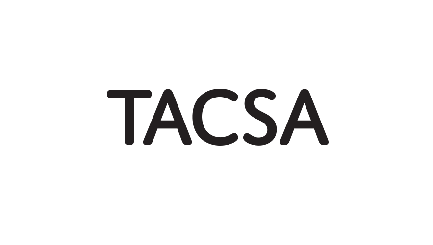
Because the registered name is too long and the word “tecno” was too generic, the acronym TACSA was retained as the brand name. This version also helped to unify the logo design.
Design Solution
LOGO DESIGN
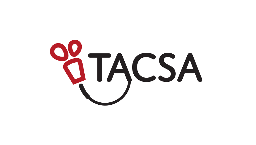
To keep the brand at a human level and to continue to be recognized by its current clients, the new logo update focuses on reflecting the company’s evolution.
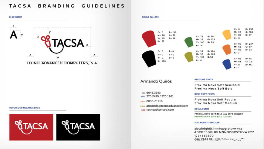
The new TACSA logo retains its mixed style of image and type. The end-tail of the icon creates a new bond to the name that reminds us of a smile. However, under very unique circumstances, its parts can be separated to allow adaptability.
Following the flat minimalist style, the new logo gives multiple curves to help soften its edges. Now, the overall shape is cleaner, more geometric, and nerveless more approachable.
The new sanserif typography is simple, direct, and carries the curvy edges that help to reinforce the overall design.
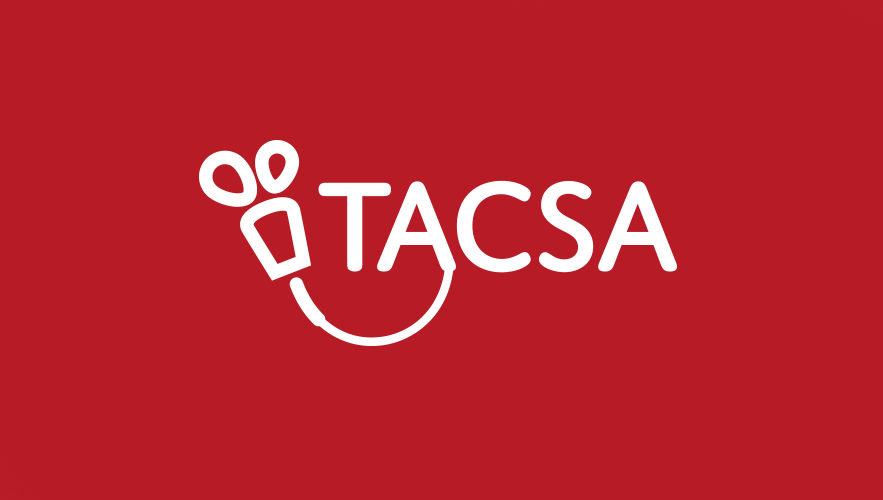
A final touch is given by the touch of a cheery red hue. It shows TACSA’s bold and unique personality.
Name
Logo placement
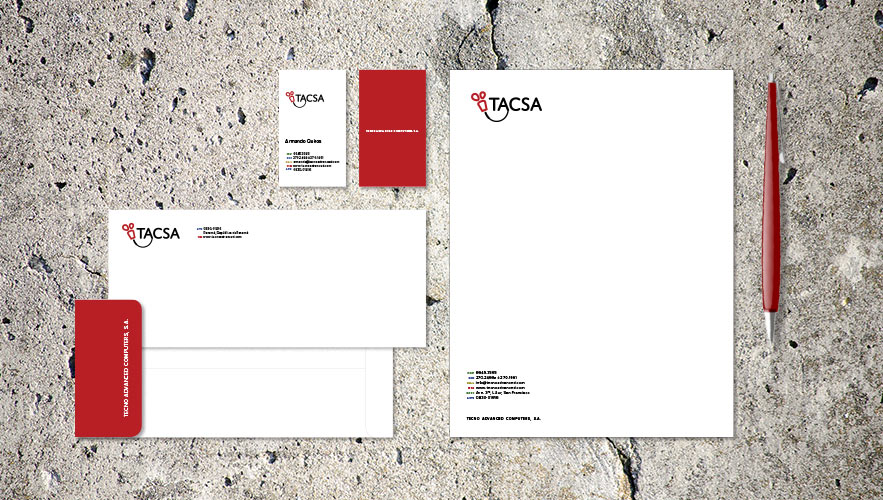
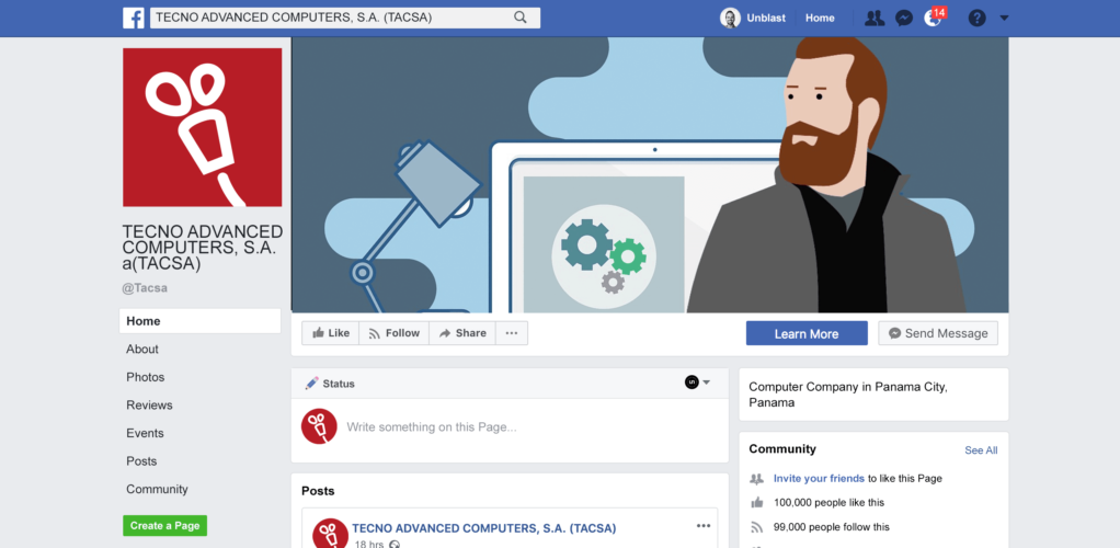
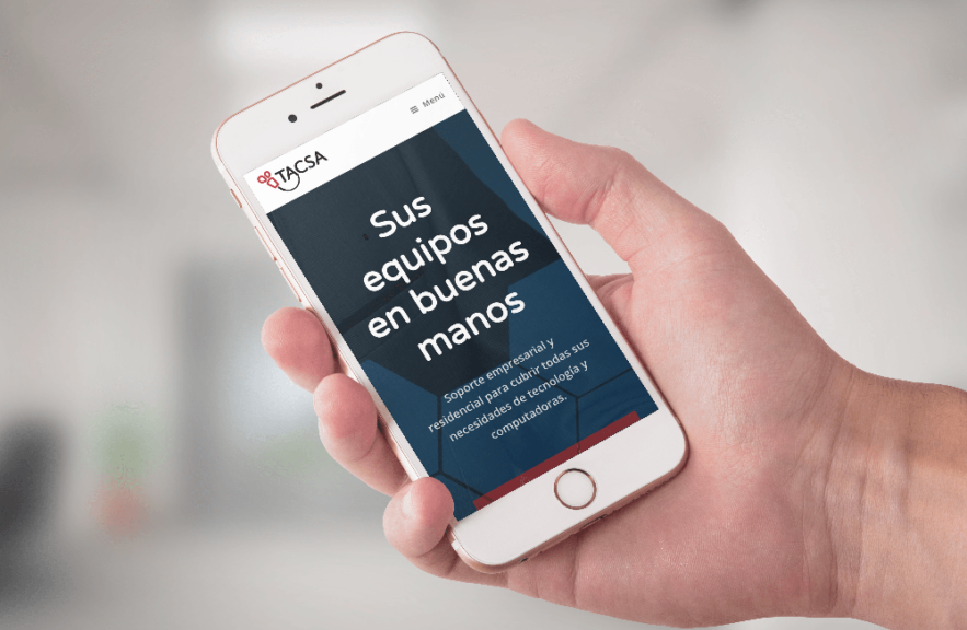
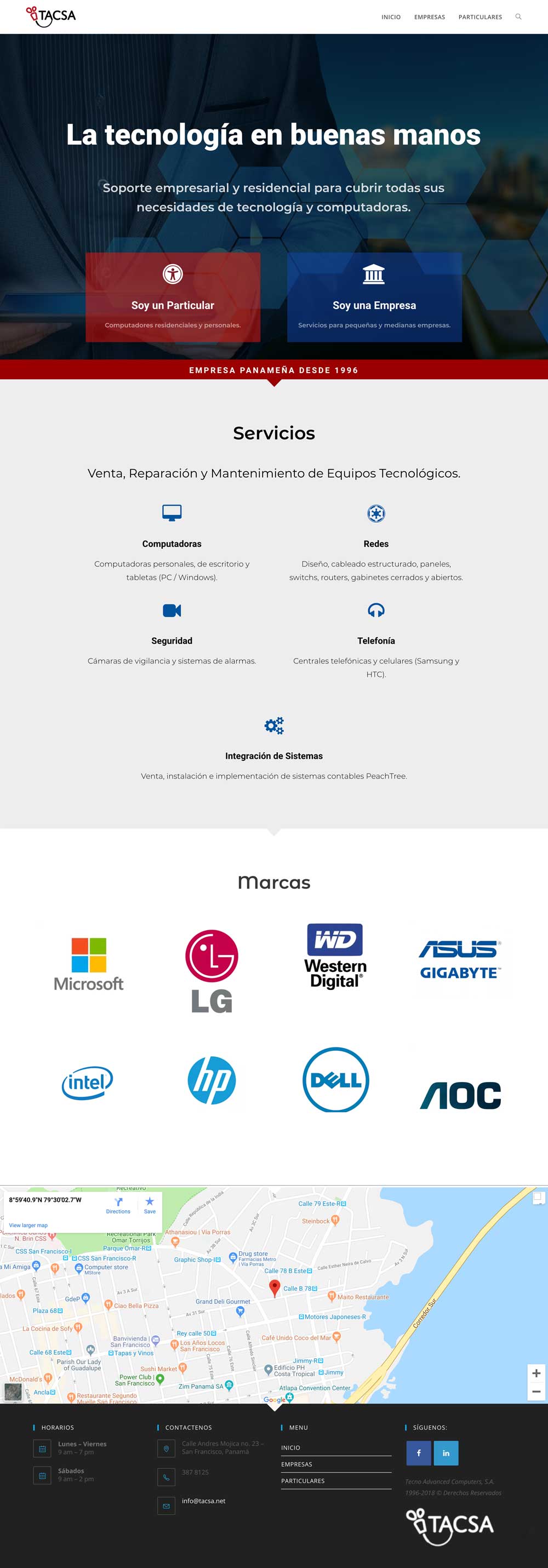
To complement the new logo design, the stationery, Facebook page and the website (www.tacsa.net) were created. While the stationary color palette is more restrictive by focusing on the TACSA red, the digital media used secondary colors and images to make them more dynamic.
Portfolio TACSA LetterHead
Portfolio TACSA Graphic Chart
Brand Images
A mix of photography and illustrations enhance the message and helps the clients to recognize the services. These images support and give great flexibility to TACSA communication efforts.
This site uses cookies to enhance your experience. We will assume that you agree to this, but you can opt out if you wish.AcceptRejectLearn +
Privacy & Cookies Policy
Privacy Overview
This website uses cookies to improve your experience while you navigate through the website. Out of these, the cookies that are categorized as necessary are stored on your browser as they are essential for the working of basic functionalities of the website. We also use third-party cookies that help us analyze and understand how you use this website. These cookies will be stored in your browser only with your consent. You also have the option to opt-out of these cookies. But opting out of some of these cookies may affect your browsing experience.
Necessary cookies are absolutely essential for the website to function properly. This category only includes cookies that ensures basic functionalities and security features of the website. These cookies do not store any personal information.
Any cookies that may not be particularly necessary for the website to function and is used specifically to collect user personal data via analytics, ads, other embedded contents are termed as non-necessary cookies. It is mandatory to procure user consent prior to running these cookies on your website.